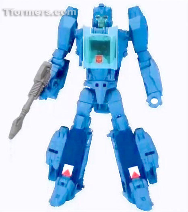
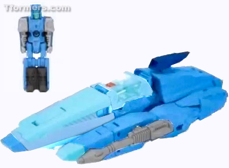
Since the first roughly postage stamp size reveal of the new Deluxe Blurr, one issue has been raised frequently: the colors are wrong. The figure we've gotten to see is far darker than the standard colors for Blurr. The slightly better resolution images we were able to finally see just recently did reveal more variation of color than first expected, but it was all still wrong. But what we're seeing may not be the truth. Keep reading to find out more.
So first, I should explain that the current theory is that the figure represented in these images is probably a greyscale prototype or early testshot which has been digitally colored. This is an important element in figuring out Blurr's colors. I'm going to explain a bit about digitally coloring objects in a program like Photoshop to elaborate. I've done more than a few digital recolors of toys over the years - you know the sort, taking one thing and making it in to something else by recoloring over a photo. And I've learned some things by doing that. To preserve the visibility of physical details, you need to color in such a way that it's partly transparent. Programs like Photoshop have built in methods to do this with a click and selection from a menu, but anything that lets you work in layers with varying transparency can behave the same way even if you have to exert a bit more manual control over it. What you have to take in to account in the process of that is how the new colors will be affected by the darkness of the layer beneath it.
Almost always you need to start by desaturating the base image - removing all color from it. That prevents weird blending effects to begin with. Now, with a grey prototype that's less of a consideration since it's already not colored. The next step, at least in my process, is bringing the tone up as close to white as possible while retaining the physical details. Doing that results in the colors you pick staying as close to themselves as possible. If you paint a transparent color over a dark surface, the dark surface is going to make the color darker. Simple concept, right? And by this point you can probably follow what I'm getting at with Blurr. I started to think the colors on this image were skewed by whoever colored it for mockup purposes didn't take that in to account. Afterall, for something meant to be an internal file just existing as a proof of concept, it doesn't need to be perfect. So I thought there was a good chance that the colorist used the colors intended for the toy, which meant there was also a chance of teasing those out of these images.
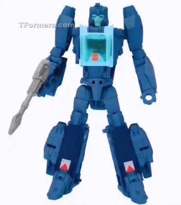
I can't say that these results are 100% accurate. After all, the entire exercise is built on guesswork, albeit educated. I'm encouraged by what I got by doing nothing more than changing the midtone and highlight values of the photos, and am now hopeful that when we get to see the toy for real, it will more closely follow what these adjusted images depict. Mind you, I still think that the figure needs some more deco in robot mode. Even being in a more properly Blurr coloring, the body still comes off a bit too homogenous without any extra color or contrast values to break it up. We can only hope that will be something added by the time we see Blurr again.
And barring any surprise reveals from Hasbro like Leader Class Soundwave, our next chance at seeing Blurr will probably be Toy Fair in approximately one month! TFormers will be there covering all the reveals, so if you don't want to miss anything stay right here with us.